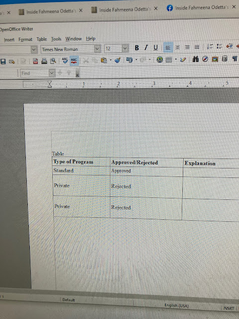
I received a form/letter notifying me of a decision that caused some confusion. One person thought the decision was a rejection (maybe because that was the first thing she noticed or maybe because she doesn't know the type of plan I am on). When I reviewed the form carefully, I realized that the decision was actually 'approved'. There were two lines with 'rejected' and one line with 'approved' that applied to me. The 'rejection's seemed to be highlighted in some way. I am attaching an example to make this clearer. Notice that there are two lines with 'rejected' and one line with 'approved.' The two lines with 'rejected' do not apply to me. I think this shows that white space and usability could make a difference.


No comments:
Post a Comment